Sunday, 31 January 2010
Saturday, 30 January 2010
Friday, 29 January 2010
Thursday, 28 January 2010


Wednesday, 27 January 2010
Saturday, 23 January 2010


Friday, 22 January 2010

Thursday, 21 January 2010


Wednesday, 20 January 2010


Tuesday, 19 January 2010


Monday, 18 January 2010


Sunday, 17 January 2010
Type 01: Anatomy of ITC Lubalin Graph Std
 ITC Lubalin Graph Std is a 1970’s slab-serifed typeface where all ascenders are equal in height to the cap height and all lower case crossbars are equal to the x-height; as are all lower case head serifs. The construction of every letterform is consistently continuous, although deliberate points of transition can be found between the straight and curved strokes. The curves themselves are of a perfectly circular and continuous nature and all letterforms have been modelled with no contrast; thicks and thins are even. Likewise there is no axis of contrast. All upper case characters sit on the baseline with upright stems, except for obvious letters such as v, w, x and z. The upper case crossbar on the letter A is equal in height to that of the lower case E, whilst the bottom edge of the upper case G crossbar is equal to half the x-height; where the two stems intersect. Meanwhile the crossbars on the upper case E, F and H are all set slightly higher and sit on a plain equal in height to the upper edge of the upper case G crossbar. Overall the typeface is light in colour and the weights within the family are book and demi. Two key characters that stand out are both found within the upper case letterforms. The upper case R is distinctive in having an open counter where the bowl and upright stem do not meet. The upper case Q is distinctive for its oval-curved tail that contrasts against other curves within the family.
Saturday, 16 January 2010
Friday, 15 January 2010
OUGD202: Rationale
BRIEF TITLE:
Movie Season – 5 x 10 second Television Idents.
SUBJECT AND RATIONALE:
Subject:
A movie season that encapsulates an array of contemporary World War Two themed titles. Considered films include Inglorious Basterds, Valkyrie, Pearl Harbour, Saving Private Ryan, Schlinders List, U571, Stalingrad, Flags of Our Fathers, Windtalkers, Defiance and Enemy At The Gates.
Audience:
The promotional idents will be aimed at a younger generation. 18-25’s - both male and female. The bottom age bracket may be lowered slightly depending on the final film selection and their respective BBFC certificates.
Tone of Voice:
The audio and visual terminology should include subject specific lexis with key phrases that relate to the topic directly. The language used however should not be completely alien to an audience un-familiar/un-educated with the theme of World War Two. Terms such as ‘Perestroika’ and ‘Glasnost’ illustrate this. The idents will assume the responsibility of acting as a persuasive vehicle that will encourage viewers to watch the movie season throughout. Pre-existing fans of the genre should be left excited and enthused about the movie season based on the assumption that they will have seen many of the films before and will already have their own opinions about the features.
DESIGN CONCEPTS:
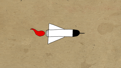
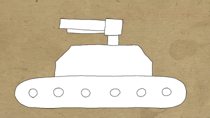
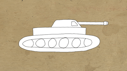
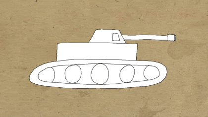
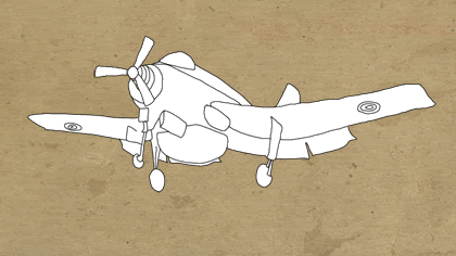
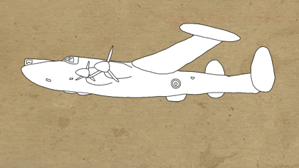
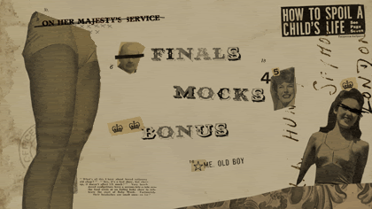
Based upon preliminary research into World War Two propaganda and newspapers from the period, colours will be of a muted appearance and often faded with themes centralized around patriotism. Reds, whites and blues most commonly. This is in addition to black and white print and sepia toned images. The imagery itself will also be relevant to the period and themed upon key military iconography: Planes, tanks, guns, bullets, explosions, gas masks, soldiers, ranks and badges, Churchill, Hitler, Nazis, helmets, boots, grenades, bombs etc. Typefaces according to sourced material were often of a sans serif nature, although serifed fonts were also used. Helvetica, Clarendon, Bell Gothic and Franklin Gothic represent initial considerations regarding this. Handwritten type additionally seemed popular, commonly emulating the aesthetic of chalkboard lettering. I further intend to make use of aged cinema conventions typical of the period. Grainy film riddled with black spots and scratches is one example. As is the frequently unsteady nature of the camera. Audio should be muted in similar ways to the colours. All of the above should aim to evoke a certain sense of nostalgia, even if the viewer did not live through the specific dates of the war.
Movie Season – 5 x 10 second Television Idents.
SUBJECT AND RATIONALE:
Subject:
A movie season that encapsulates an array of contemporary World War Two themed titles. Considered films include Inglorious Basterds, Valkyrie, Pearl Harbour, Saving Private Ryan, Schlinders List, U571, Stalingrad, Flags of Our Fathers, Windtalkers, Defiance and Enemy At The Gates.
Audience:
The promotional idents will be aimed at a younger generation. 18-25’s - both male and female. The bottom age bracket may be lowered slightly depending on the final film selection and their respective BBFC certificates.
Tone of Voice:
The audio and visual terminology should include subject specific lexis with key phrases that relate to the topic directly. The language used however should not be completely alien to an audience un-familiar/un-educated with the theme of World War Two. Terms such as ‘Perestroika’ and ‘Glasnost’ illustrate this. The idents will assume the responsibility of acting as a persuasive vehicle that will encourage viewers to watch the movie season throughout. Pre-existing fans of the genre should be left excited and enthused about the movie season based on the assumption that they will have seen many of the films before and will already have their own opinions about the features.
DESIGN CONCEPTS:
Based upon preliminary research into World War Two propaganda and newspapers from the period, colours will be of a muted appearance and often faded with themes centralized around patriotism. Reds, whites and blues most commonly. This is in addition to black and white print and sepia toned images. The imagery itself will also be relevant to the period and themed upon key military iconography: Planes, tanks, guns, bullets, explosions, gas masks, soldiers, ranks and badges, Churchill, Hitler, Nazis, helmets, boots, grenades, bombs etc. Typefaces according to sourced material were often of a sans serif nature, although serifed fonts were also used. Helvetica, Clarendon, Bell Gothic and Franklin Gothic represent initial considerations regarding this. Handwritten type additionally seemed popular, commonly emulating the aesthetic of chalkboard lettering. I further intend to make use of aged cinema conventions typical of the period. Grainy film riddled with black spots and scratches is one example. As is the frequently unsteady nature of the camera. Audio should be muted in similar ways to the colours. All of the above should aim to evoke a certain sense of nostalgia, even if the viewer did not live through the specific dates of the war.
Tuesday, 12 January 2010
Friday, 8 January 2010
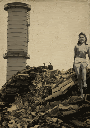
Armley Mill
Although this visit was a short while back now, the purpose of it remains the same and is currently more relevant than it has ever been. In searching to gain inspiration from dated typography and vintage poster imagery, the photographs below show a snapshot of the strong contextual links that Armley Mill's interior has to the nostalgic theme of World War Two movies that I am persuing at present...


Sunday, 3 January 2010
Saturday, 2 January 2010


Subscribe to:
Comments (Atom)
